How To Read Your Solar Monitoring Dashboard
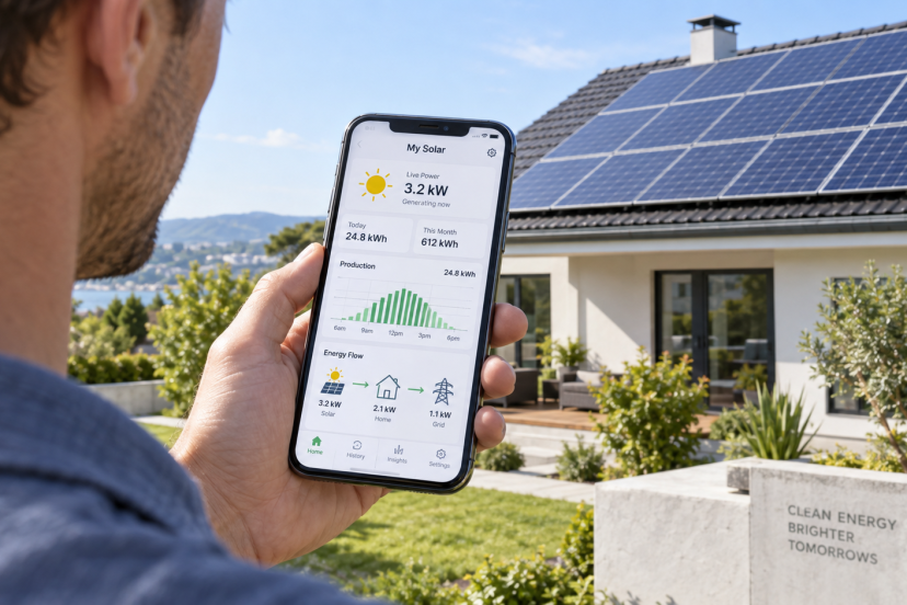
A Solar Monitoring Dashboard can feel a little like the instrument panel in a car: useful once you know what the numbers mean, confusing when you do not. You may see production curves, kilowatts, kilowatt-hours, grid arrows, consumption totals, alerts, and perhaps battery data—all changing throughout the day. The goal is not to stare at every fluctuation. It is to learn which patterns are normal and which deserve a closer look.
This guide explains how to read a Solar Monitoring Dashboard step by step, compare output fairly, interpret import and export, recognize possible faults, and choose useful monitoring hardware when your existing system lacks detail. By the end, you should be able to open your dashboard and understand what the data is actually telling you.
What a Solar Monitoring Dashboard Is Actually Showing
A Solar Monitoring Dashboard turns electrical measurements into charts and status indicators. It may show solar production, household consumption, grid import and export, battery activity, or panel data.
Do not assume every number is directly measured. Some systems need extra sensors or a compatible meter for consumption and grid flow. The U.S. Department of Energy notes that monitoring can collect data at system, inverter, string, or module level.
First, confirm what your setup actually measures.
Start With kW and kWh
The first distinction matters: kilowatts (kW) describe power right now, while kilowatt-hours (kWh) describe energy accumulated over time.
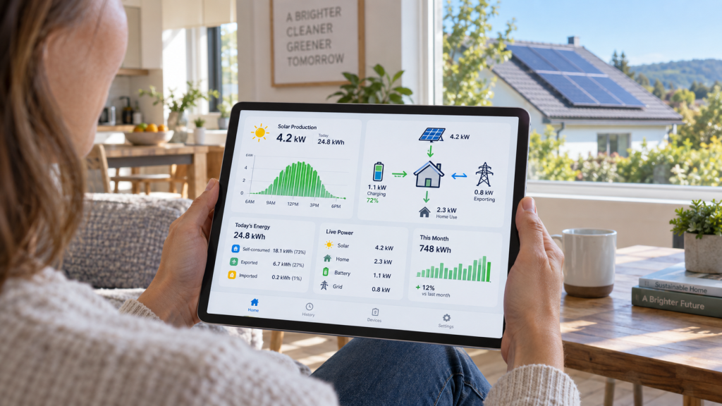
If your array produces 4 kW at noon, that is its output at that moment. If it produces 24 kWh by sunset, that is the day’s energy total.
A simple way to think about it is that kW measures the rate of power, while kWh measures how much energy is used over time. Use kW for moment-to-moment behavior and kWh for daily, monthly, billing, or long-term comparisons.
Read the Daily Solar Production Curve
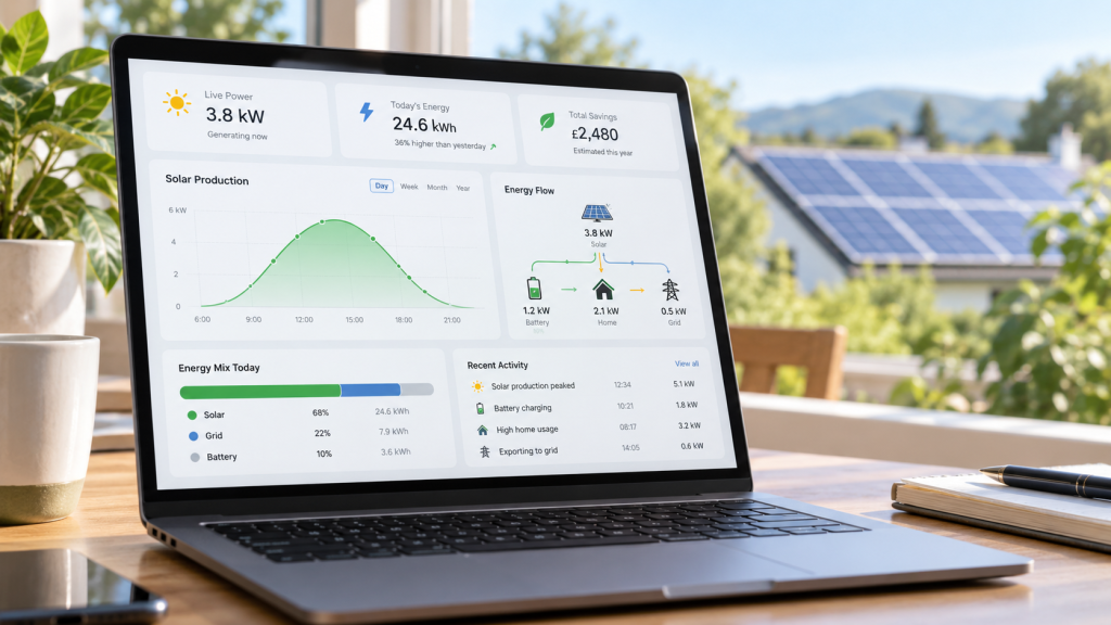
Open the day view. On a clear day, production generally rises after sunrise, strengthens around the middle of the solar day, then falls toward sunset. Direction, shade, weather, inverter limits, and season shape the curve.
Clouds can create sharp dips. Repeated dips at the same time on clear days may point to shade, while a flat top can sometimes reflect inverter clipping.
Ask whether the pattern makes sense for the conditions—not whether it looks perfect.
Compare Today With Useful Time Periods
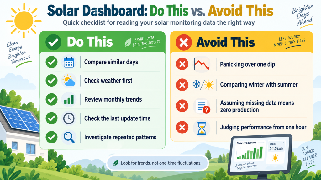
One weak afternoon tells you little. Compare your Solar Monitoring Dashboard across similar periods: one clear day against another, this month against the same month last year, or year-to-date output against a sensible model.
Season and weather matter, so avoid comparing unlike periods.
NREL’s PVWatts Calculator estimates grid-connected PV output using system and site inputs. Treat the result as a benchmark rather than a guarantee because weather and modeling assumptions introduce uncertainty.
Understand Consumption, Self-Consumption, Import, and Export
If your dashboard includes household load data, learn four flows: production is solar generation; consumption is household use; self-consumption is solar used directly at home; and import/export is electricity taken from or sent to the grid.
If solar produces 5 kW while the home uses 3 kW, the surplus can flow to a battery or the grid. When production falls below demand, the grid or battery fills the gap.
This view can also reveal when flexible loads fit stronger solar hours.
Check Inverter and System-Status Indicators
Look for inverter state, communication status, and the “last updated” timestamp. A green status usually suggests normal operation, but fault-code meanings vary by manufacturer.
A frozen Solar Monitoring Dashboard does not automatically mean the panels stopped producing. Wi-Fi, cellular, gateway, or cloud communication can fail while the inverter keeps working.
Start with the timestamp. Then check inverter status and alerts before assuming there is a generation fault. That separates missing data from an actual shutdown.
Use Panel-Level Data Without Overreacting
Module-level monitoring can expose persistent outliers, but neighboring panels rarely produce identical numbers. Shade, debris, orientation, and temperature can create differences.
Instead of reacting to one low panel during a cloudy hour, compare it with nearby modules over several similar days. Repeated gaps matter more than one dip.
Treat the layout as a diagnostic clue. If one module keeps lagging under comparable conditions, save the evidence for your installer.
Factor in Weather, Heat, Shade, and Season
Lower output is not automatically equipment trouble. Clouds reduce available sunlight, seasonal sun angles change production, and hotter modules can produce less power on bright days.
Shade often creates repeatable patterns. If dips appear at the same time on sunny days, compare nearby obstructions and orientation; SolarFlez’s solar panel placement guide explains how roof direction, ground mounting, and shade can shape output.
Weather context makes the Solar Monitoring Dashboard clearer.
Know Which Alerts Deserve Attention
Treat alerts as prompts to investigate, not proof of a major failure. Communication warnings may involve connectivity, while inverter or electrical faults can require a professional.
Record the code, timestamp, affected device, and any production change. Then check current manufacturer guidance before resetting equipment.
Repeated shutdowns, burning smells, visible electrical damage, exposed wiring, or overheating signs need professional attention, not app-level troubleshooting.
What Research Says About Solar Monitoring Data
Good monitoring combines measurements with context. The U.S. Department of Energy’s PV monitoring guidance explains that systems can measure power, voltage, and current at different array levels. That is why dashboards can differ in detail.
Sandia National Laboratories’ Performance Ratio guidance describes a normalized metric but notes that temperature and season affect it. One percentage should not become your only health check.
The IEA PVPS analytical monitoring guidance discusses using measurements and failure patterns to identify shading, inverter, and module issues. Persistent patterns matter more than isolated readings.
NREL’s PVWatts modeling tool can frame expected production, but modeled results include uncertainty and weather varies year to year. Use ranges and trends rather than one pass/fail target.
Recommended Products for a Solar Monitoring Dashboard
If your inverter app lacks consumption data, circuit detail, or integrations, an add-on monitor can help. Service-panel installation involves hazardous voltage, so follow manufacturer requirements and use a qualified electrician where appropriate.
| Product | Best fit | Key distinction |
| Emporia Vue 3 | Circuit-level detail | Whole-home plus branch-circuit monitoring |
| Sense Energy Monitor with Solar | Appliance insights | Solar and load analysis |
| Eyedro EYEFI-4 | Net-metering visibility | Solar and household monitoring |
| Shelly Pro 3EM | Three-phase/integration users | DIN-rail networked metering |
| IAMMETER WEM3050T | Open smart-home setups | Bidirectional data and local integrations |
Emporia Vue 3 Home Energy Monitor
Best for: Homeowners who want circuit-level detail
Vue 3 combines whole-home monitoring with individual circuit sensors, while Emporia’s platform supports solar generation and net-metering views. It suits readers whose Solar Monitoring Dashboard shows production but not where electricity is going. Multiple current transformers need panel space and careful installation, which is the main practical consideration.
Sense Energy Monitor with Solar
Best for: Readers who want appliance-pattern insights
Sense combines household monitoring with solar sensors, showing production and consumption together. Its software also attempts to identify appliance signatures over time. That can add context, but detection may take time or remain incomplete. Choose it primarily for energy visibility rather than guaranteed recognition of every appliance.
Eyedro Home Solar & Energy Monitor EYEFI-4
Best for: Users who want a focused solar-and-grid view
Eyedro’s EYEFI-4 uses Wi-Fi and current sensors to track solar generation and electricity use together, with historical web and mobile reporting. It fits readers who value production, consumption, and net-metering trends over appliance detection. Check panel layout and sensor requirements before choosing it for your service configuration.
Shelly Pro 3EM (120A)
Best for: Three-phase systems and smart-home integrators
Shelly Pro 3EM is a DIN-rail meter for single- or three-phase measurement with network connectivity. Bidirectional metering makes it relevant to PV energy flows, while integration options suit technically confident users. It is more infrastructure-oriented than a simple consumer display, so installation and configuration need extra planning.
IAMMETER WEM3050T WiFi Energy Meter
Best for: Users who value local data and open integrations
The WEM3050T supports solar monitoring, bidirectional import/export measurement, and multiple electrical configurations. IAMMETER documents local APIs plus MQTT, Modbus/TCP, and Home Assistant support. That flexibility suits advanced users who want control over their data; readers seeking a simple app-only experience may prefer a more consumer-focused monitor.
Troubleshoot Strange Numbers in the Right Order
When the Solar Monitoring Dashboard looks wrong, start simple. Check data freshness, date range, weather, and system status. Then verify whether the questionable value is power or energy and whether it is measured or estimated.
If one device repeatedly underperforms, save screenshots plus dates, conditions, alerts, and fault codes. That record helps your installer.
Do not open inverter enclosures or live panels just to investigate a number. Use monitoring to narrow the problem before electrical work becomes necessary.
Build a Simple Monitoring Routine
You do not need to watch your Solar Monitoring Dashboard every hour. Check system status periodically, review production for obvious gaps, and compare monthly energy with prior periods and seasonal behavior.
Also look after major storms, extended outages, networking changes, or electrical work. With consumption monitoring, occasionally confirm that large loads occur when expected.
Once you know the system’s normal rhythm, unusual behavior becomes easier to recognize without checking every day.
Solar Monitoring Dashboard FAQs
Why is my Solar Monitoring Dashboard showing zero production?
Zero is normal at night. During daylight, first check the dashboard’s last-update time and communication status. A gateway or internet problem can stop new data even while the inverter operates. If the data is current and the inverter reports a fault or remains offline in good daylight, follow the manufacturer’s guidance or contact your installer.
Why does dashboard production not match my electric bill?
They measure different things. Your solar system reports generation, while the utility meter records grid import and, where applicable, export. Solar used directly in your home may never appear as grid import. Billing periods, tariff rules, and data intervals can also differ. Compare matching dates and confirm what each system measures before assuming either is wrong.
Is a sudden dip in solar production always a problem?
No. Passing clouds, temporary shade, weather changes, or normal inverter behavior can cause short dips. Compare the same time across several similar clear days. If the drop repeats under comparable conditions, consistently affects one device, or appears with a fault code, investigate further. A pattern is more informative than one low point.
How frequently should I review my Solar Monitoring Dashboard?
For most homeowners, periodic checks plus a monthly trend review are enough unless the system sends an alert. Learn your normal seasonal pattern and watch for missing data, sustained production changes, or recurring device warnings. Constant checking can make ordinary weather-driven variation seem more dramatic than it is.
Do I need an extra energy monitor if my inverter already has an app?
Not necessarily. If your app already shows the production, consumption, grid-flow, battery, and device-level information you need, another monitor may add little value. An add-on becomes more useful when you want household circuit data, local smart-home integrations, or consumption information that your current Solar Monitoring Dashboard cannot measure.
Final Recommendation: Use Your Solar Monitoring Dashboard for Trends, Not Guesswork
A Solar Monitoring Dashboard becomes genuinely useful when you stop judging isolated numbers and start reading patterns. First learn the difference between kW and kWh. Then watch the daily curve, compare similar periods, add weather context, and understand how production, consumption, import, and export relate.
If your existing platform lacks household detail, the Emporia Vue 3 is a strong fit for circuit-level visibility, while IAMMETER WEM3050T suits readers who want more open integrations. You may not need extra hardware if your inverter app already answers your questions.
The best habit is simple: establish what “normal” looks like for your system, investigate persistent changes methodically, and bring in qualified help when electrical faults or repeated warnings appear.